When asked to develop something for people’s visual impairments, the first question that often comes up is: how will this work in a screen reader? Yes, while a complete visual deficiency tends to be the place where the most focus takes place, it does not always address the most common of the visual impairments; individuals with Color Vision Deficiency (CVD).

Figure 1: University of Michigan recently announced a braille tablet.
So, how prevalent is CVD? According to some estimates, it as high as 1 in every 12 men / 1 in every 200 women in the world, and in most cases inherited genetically. That’s an incredibly high number and it’s something that great design needs to account for. Let’s look at a recent case that highlights the effects of CVD on design.
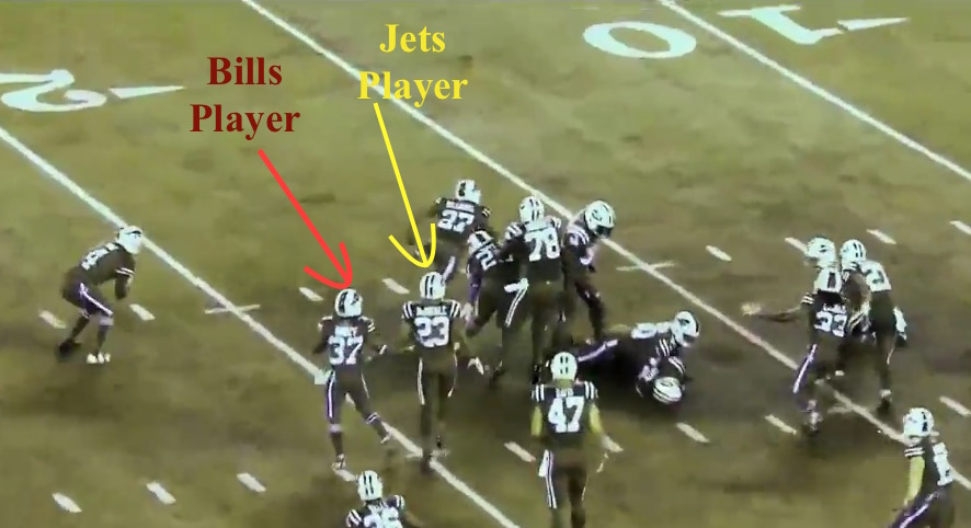
During this year’s National Football League season, a major manufacturer of equipment for the NFL decided to go outside of the box and create super bright, monochromatic uniforms for the teams. As far as a marketing strategy went, this made complete sense – vivid colors make things pop! The players would appear to move more quickly; the game would be that much more exciting!

Figure 2: NFL Color Rush – Bills vs Jets 2015
The problem was, the uniforms were not designed to take CVD into consideration, as the NFL later admitted. When the game was ultimately played, there were thousands of people flooding the social networks up in arms that the game was impossible to watch.

Figure 3: What the Color Rush experiment looked like to a person with CVD.
IntraSee Believes Accessibility is Important!
The NFL is one of the biggest stages in the United States, and even they missed out on something that affects approximately 8% of men in the world. This could have been easily remedied if accessibility guidelines were taken into consideration from the beginning.
At IntraSee our design begins with accessibility in mind, and our development follows through with it.
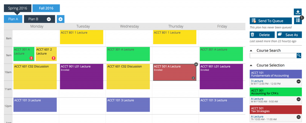
Take for instance the IntraSee Academic Planner. It is designed to display each course in a student’s plan as a different colored element in a grid. This is incredibly useful to quickly group courses together and spatially determine if the schedule makes sense.

Figure 4: IntraSee’s Academic Planner Auto Contrast Feature
Those colors, in the grid, are a configuration setting during implementation. Any color combination can be implemented to both match your organization’s brand and maintain the proper color contrast ratios. The Academic Planner even provides personalization options allowing the student to pick their own colors! Our technology will automatically adjust font colors for optimal contrast. Those are the details that make for great design for the entire population.
Our development methodology always includes rigorous accessibility reviews and our products are developed in a way that allows for configuration including the ability to incorporate advanced accessibility features such as ARIA.
At IntraSee, we have always said user experience is not a pretty picture. It is a mindset, and it considers angles that are often missed. We understand how important it is for your employees and students to be able to use the system you provide without any limitations. Contact us to learn more.


