When asked to develop something for people’s visual impairments, the first question that often comes up is: how will this work in a screen reader? Yes, while a complete visual deficiency tends to be the place where the most focus takes place, it does not always address the most common of the visual impairments; individuals with Color Vision Deficiency (CVD).

Braille Tablet

Figure 1: University of Michigan recently announced a braille tablet.

So, how prevalent is CVD? According to some estimates, it as high as 1 in every 12 men / 1 in every 200 women in the world, and in most cases inherited genetically. That’s an incredibly high number and it’s something that great design needs to account for. Let’s look at a recent case that highlights the effects of CVD on design.

During this year’s National Football League season, a major manufacturer of equipment for the NFL decided to go outside of the box and create super bright, monochromatic uniforms for the teams. As far as a marketing strategy went, this made complete sense – vivid colors make things pop! The players would appear to move more quickly; the game would be that much more exciting!

Green Jets vs. Red Bills

Figure 2: NFL Color Rush – Bills vs Jets 2015

The problem was, the uniforms were not designed to take CVD into consideration, as the NFL later admitted. When the game was ultimately played, there were thousands of people flooding the social networks up in arms that the game was impossible to watch.

Bills vs. Jets in Red/Green

Figure 3: What the Color Rush experiment looked like to a person with CVD.

IntraSee Believes Accessibility is Important!

The NFL is one of the biggest stages in the United States, and even they missed out on something that affects approximately 8% of men in the world. This could have been easily remedied if accessibility guidelines were taken into consideration from the beginning.

At IntraSee our design begins with accessibility in mind, and our development follows through with it.

Take for instance the IntraSee Academic Planner. It is designed to display each course in a student’s plan as a different colored element in a grid. This is incredibly useful to quickly group courses together and spatially determine if the schedule makes sense.

Academic Planner Contrast

Figure 4: IntraSee’s Academic Planner Auto Contrast Feature

Those colors, in the grid, are a configuration setting during implementation. Any color combination can be implemented to both match your organization’s brand and maintain the proper color contrast ratios. The Academic Planner even provides personalization options allowing the student to pick their own colors! Our technology will automatically adjust font colors for optimal contrast. Those are the details that make for great design for the entire population.

Our development methodology always includes rigorous accessibility reviews and our products are developed in a way that allows for configuration including the ability to incorporate advanced accessibility features such as ARIA.

At IntraSee, we have always said user experience is not a pretty picture. It is a mindset, and it considers angles that are often missed. We understand how important it is for your employees and students to be able to use the system you provide without any limitations. Contact us to learn more.

Contact Us

The modern user

Gone are the days of purchasing software by a matrix of features. Today’s enterprise users expect more from their applications. They expect them to be easy to use, mobile, and integrated. Successful enterprise IT projects are now measured by user satisfaction, adoption rates, and reduced helpdesk calls. Your users expect more and now is the time for a new approach.

A link farm won’t solve your problems

Time and again, our user studies turn up one fact: people want one place to go for everything. One list of to dos, one search, and one look and feel. Link farms just won’t get the job done. They expect to see data and applications from PeopleSoft intermixed cohesively with Cloud applications. They expect easy navigation, step-by-step guides, logical organization and a powerful search.

Today’s IT environment is as complex as it has ever been and PeopleSoft usually sits in the middle. The confusion caused be this is overwhelming users and their frustration threatens an organization’s efficiency and its investments in various ERP solutions.

Our mission

IntraSee is focused on solving these problems with our blend of cutting-edge solutions and high-touch consulting services. We do it by always looking through the user’s eyes and challenging conventional thinking.

Learn more About Us or our Products & Services or Contact Us and learn how we can  help your organization.

This year’s conference highlighted the continuing focus in the industry on the User Experience and the Cloud. IntraSee was there, as presenters and at the HCM Pavilion, and here’s our summary on what we saw.

Fluid

In PeopleTools 8.55, a user’s homepage will now be the default landing page for Desktop, Smartphone and Tablet users (though this default can be changed). This is the familiar page with 9 tiles in a 3-by-3 formation. Additionally, all users will now only get the Fluid slide-out menu as the Enterprise Menu is being retired. If you have done work on your branding in PeopleSoft, you will want to allocate time during your 8.55 upgrade to ensure you don’t lose your current experience.Fluid HomepageMost importantly, Oracle announced that Classic and Fluid will co-exist for quite some time. Each organization needs to have a strategy for how this mix is best deployed to their users. If you need some guidance on blending Classis and Fluid, IntraSee can help. Just contact us and we will talk you through the considerations and can even show you a demo of how best this can be done.

Contact Us

Cloud

The Cloud was probably the most used term all week. It is clear that Oracle’s strategy is to continually offer more and more Cloud options to its customers. Where Oracle differs is that it plans to have Cloud and On-Premise/Hosted options so that organizations can move at their own pace. Additionally, it allows organizations to not get trapped in the cloud should they ever need to move back.

It is clear most organizations are going to take baby steps into the Cloud. This seems the safest path. However, it does pose a user experience challenge. How does a user know that to process a transfer they need the PeopleSoft URL, to approve a job req they need the Taleo URL and to look at their team’s performance they need the HCM Fusion Cloud URL? Consequently there has never been a greater need for Cloud integration. Because of that we have built a suite of Cloud Adapters that allow the consolidation of multiple applications in the Cloud into one user experience. Our Cloud Adapters allow an organization to seamlessly take steps into the Cloud without putting a burden on its users. One site with PeopleSoft, Cloud apps, Classic components, Fluid Components, Content & Search. All fully accessible on both the desktop and mobile devices in a responsive fashion!

In the PeopleTools track there were more sessions on Fluid than any other technical feature. Fluid is a newly built page processor technology that allows the elements of a page to move around with changing screen sizes. This allows the developer to build pages that work on desktop browsers as well as mobile devices without having to create multiple versions. Initially there are a fairly small amount of Fluid pages compared to Classic pages that Oracle will deliver. But that number will grow over time.

Contact Us

Introducing a New Branding Engine

Your Interaction Hub Brand Will Need To Change

iHub Example

The Interaction Hub (iHub), formerly known as the Enterprise Portal, has come with a branding engine since the first release. The engine allows you to configure the look and feel of your site. It is one of the tools we use to make beautiful sites that have a unique look for your organization. With the release of PeopleTools 8.54, and the new Fluid UI, a new branding engine is being deployed and delivered within PeopleTools.

The old Portal/iHub branding engine is now considered deprecated as of the release of Interaction Hub 9.1r3. That means no more updates are coming and it will soon be removed. Clients are being encouraged to adopt the new branding engine, which as come as quite a surprise to many.

Update Re: PeopleTools 8.55: The new branding engine does not govern the Fluid experience. Changing the brand of the Fluid experience requires a very different technique and has limits. Contact us and we can help take you through your options.

What is changing?

The engine is entirely different as PeopleSoft adapts to an HTML 5 standard. There are no longer concepts such as binds, bars, and layouts. There are new considerations such as Fluid compatibility and mobile. The concepts and terminology are not only different, the tools to build the brand are completely new. Since this branding engine is now implemented in PeopleTools, a new PeopleTools 8.54 brand can be easily shared across all of your PeopleSoft applications.

What do you do?

Customers will have to plan to rebuild their site branding after a PeopleTools 8.54 and Interaction Hub 9.1r3 upgrade. This is also a great opportunity to look at your design and freshen it up. Because branding is such an essential component to the user experience, it is one of IntraSee’s core strengths. Contact us today and learn how IntraSee can help you redesign your brand and reimplement it using 8.54’s branding engine.

PeopleSoft Fluid UI

With the release of PeopleTools 8.54, Oracle has included the new Fluid User Interface. Of course this has created many questions from our clients, so we will aim to clarify what you should expect from the new Fluid UI. The new interface is based on a fluid design, also known as a responsive design. This means that as your browser grows and shrinks in size, the page adjusts to maximize the use of real estate. You have likely seen this technique used on popular sites already.

Homepages vs. Applications

The Fluid UI has two primary modes: Fluid Homepages and Fluid Applications.

Fluid UI Homepage Screenshot
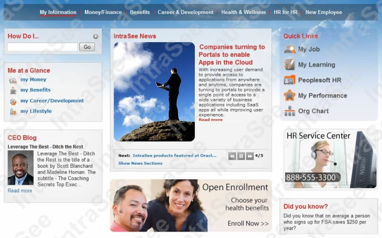
Fluid Homepages are the screenshots you have probably already seen. A collection of widgets usually as simple links or links with a small snippet of information such as account balance.

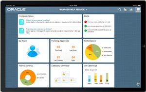
These widgets are presented using a design paradigm called “tiles” made popular by Windows 8. Using this approach each tile can fit into a phone’s display easily, while on other screens tiles can stack and re-stack to fill up the space.

Fluid Applications haven’t really seen the light of day yet. The technology to build them is part of PeopleTools 8.54, but Oracle hasn’t released any. This is why screenshots of Fluid Applications are hard to come by. In the meantime, applications will call their apps “Classic” as they incrementally release “Fluid” versions over the coming years. As of 8.54, you will see new component and page types in Application Designer that allow for fluid applications to be built.

Fluid UI App ScreenshotThe difference between a Fluid Homepage and a Fluid Application is that one is primarily navigational while the other is, basically, a responsive PeopleSoft component. They both benefit from a table-less HTML design, which is a welcome change from classic PeopleSoft. The biggest adjustment in working with Fluid Applications is that PeopleSoft development/support teams will need to increase their web skills in the areas of HTML, CSS and JavaScript. Therefore, if you plan to customize any pages that are delivered via Fluid or convert existing customizations to Fluid, this skillset will be very important. The sole use of Oracle’s App Designer is not enough and this is a primary reason our clients are coming to IntraSee for assistance.

Interaction Hub vs. Fluid UI

The Fluid UI is built into PeopleSoft’s component processor and, as such, is entirely separate from the Interaction Hub. They can be co-mingled, of course, but many design challenges remain. They look different, they have different navigational elements, and alone each can’t accomplish 100% of the job. For example, Fluid tools do not integrate an experience like the Interaction Hub nor do they have content management capabilities. The complex and confusing question becomes: how do you get a consistent and cohesive experience using classic PeopleSoft Applications, the Interaction Hub and Fluid? And then if you add SaaS applications like Taleo, Salesforce,Google, and Fusion, you now have an even more convoluted user experience. This is where having a defined user experience, and a clear approach on how to get there, truly helps.

We Can Help

At IntraSee we have a proven methodology and approach to implementing a user experience that makes sense to the user. Studies have shown us that one consistent and coherent experience is the most important factor in user satisfaction. With our methodology, knowledge-base, bolt-on solutions, skilled consulting resources and years of industry experience we will craft an experience that will delight your users.

Simplicity equals success.

Please contact us and we can setup a time to discuss your goals, the options available, and how you can maximize your user’s experience.